How to build a better ‘Contact Form’: Boost your Conversion with these tips
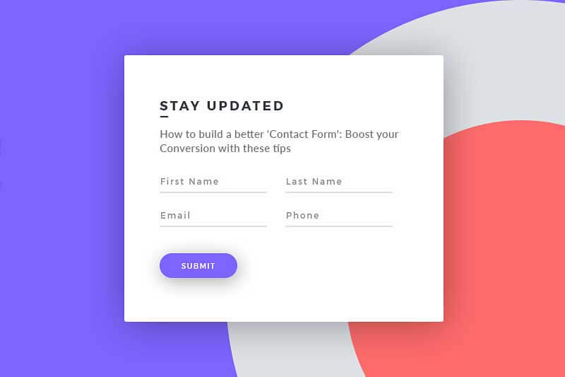
If you want people to reach you, make it easy for them. And, Contact Form is the immediate medium for your customers to connect with you directly. Needless to say, it is a medium where you get potential leads that may end up converting into big-time paying customers. Although there are many factors that can encourage conversion on your website, Contact Form is the one that can start this instantly. This may surprise you to know that many website owners choose not to include Contact Form and they stick to only ‘call us’ as CTA.
We live in a digital world and a lot of us have shucked face-to-face meetings with the virtue of digital platforms. But, for customers, being able to connect with a person directly is still vital. Sometimes, customers need to talk to a real person to get the answers. But, just adding a Contact Form alone cannot confirm the engagement. We are talking about design here, its functionality and submission analysis. Greeting and appreciating customers are the essential factors to build your brand credibility. Being generous and pleasing will help. Hence, it is essential to seek help from an expert and get your Contact Form correctly designed. Here are some ways to get your Contact Form right.
1. Name it easy to find
Although it is tempting, avoid adding quirky and fancy names to your contact form in the navigation. It should be simple, clear, and talk exact the real purpose. Avoid playing hide-and-seek; instead, highlight it saying ‘click here’. Keep the wording simple. People on your site have no time for guessing. They don’t know your ‘high-five’ button is directing to the Contact Form. You can use communication words like ‘let’s talk’ or ‘get in touch’.
According to the best Web Design Company in Chandigarh, if the users didn’t find what they were looking for, they will bounce off your website. Chances are they will never return. And, in this course, you have lost a potential lead. Also, using social media accounts in lieu of a contact page is an unsuitable alternative. Believe it or not, not everyone has social media account.
2. Design it right
It’s 2018 already and businesses are getting digitally sound. Still, there is a list of poorly designed websites that failed to get traction. The badly designed website can have your visitor wonder about the legitimate factor and might totally skip contacting you. Say no to impersonal designs and yes to a blonde, clear, and sterile webpage. We know you are emotionally connected to your brand, but your targeted customers are not! Your business face is your website, which if they like, they will connect to your brand. Avoid using your brand colors. ‘Would I like this design and click the page to contact?’ Ask yourself this question and likewise get a second, third and fourth opinion.
3. Make it mobile-friendly
More than 50% of your viewers are from mobile. Ensure your form is mobile-friendly and every information field is in working condition. Every CTA and checkbox should be functional. If your website is not responsive, contact a Website Designing Company in Chandigarh to help you make it mobile-compatible. Testing is crucial before you make it live. Test the form for functionality and get valuable feedback. Ensure that your form is delivering appropriate messages and no random declines. If you find errors, contact Website Design Company in Chandigarh to request help.
4. Underestimate Copy
Great words inspire great action. A copywriter works as a direction maker to greet your audience and assure that they are indeed where they wanted to be. Copy gives you a chance to make your brand’s credibility count. The Contact Form should directly inform the visitor what and how to do. Extend the invitation to your audience using your brand voice. Most importantly keep them short and get rid of following elements:
- CAPTCHA
- Location
- Age
- Auto sign-ups
- Hard to read text
The top Website Designing Agency in Chandigarh suggests that the form ideally must have 3-5 fields. It must not take more than 2 minutes to fill the contact fields. The form must explain to the user what probably they need.


Comments
Be The First To Comment
Post a comment